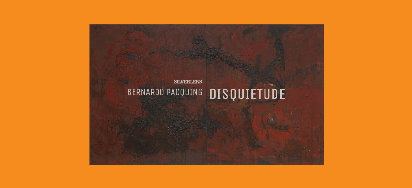
About
Silverlens is pleased to present new works by Bernardo Pacquing. The show called Disquietude is composed of a series of monochromatic paintings in various shades of red warmed by emerging bright colors under layers of pigment.
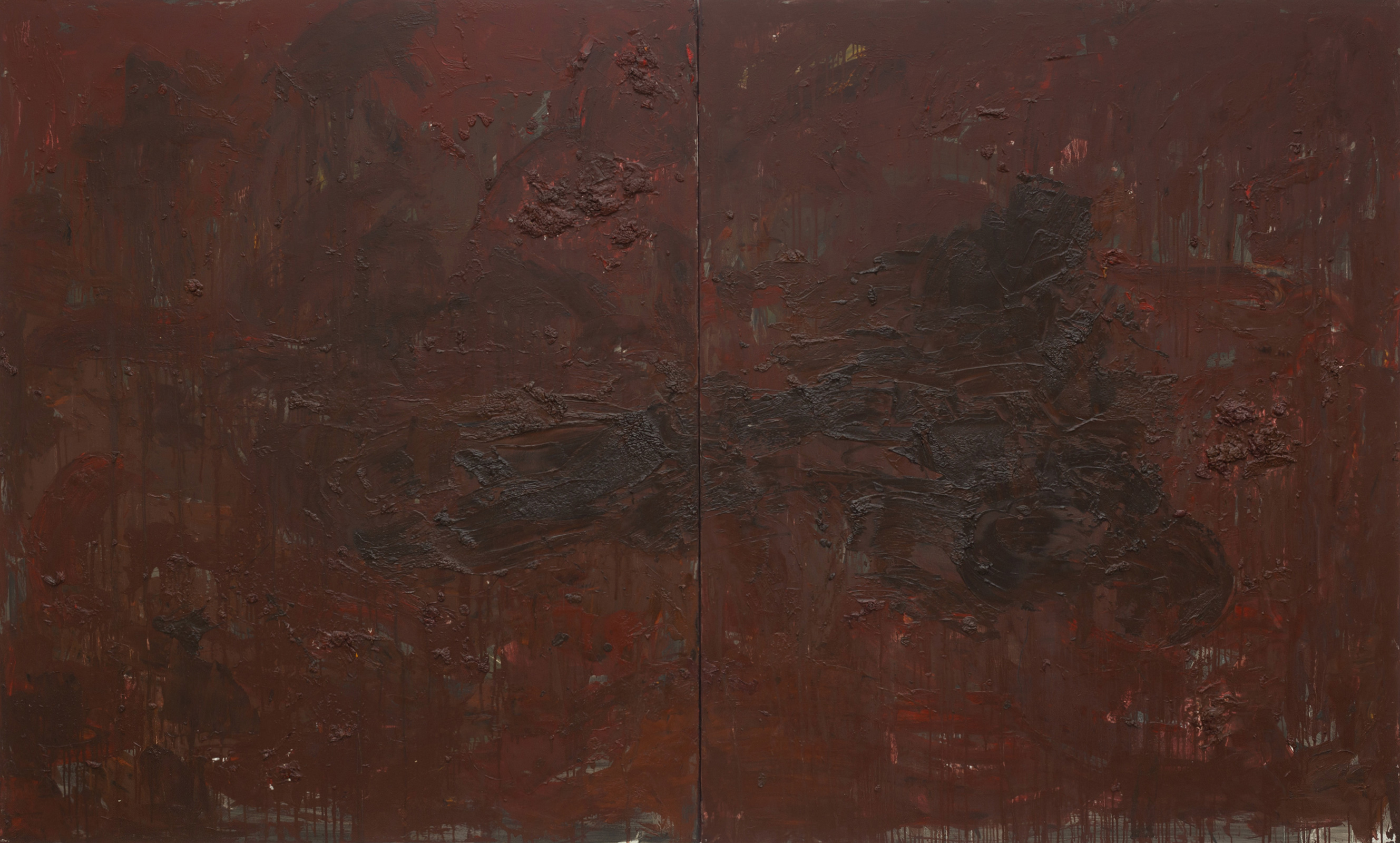
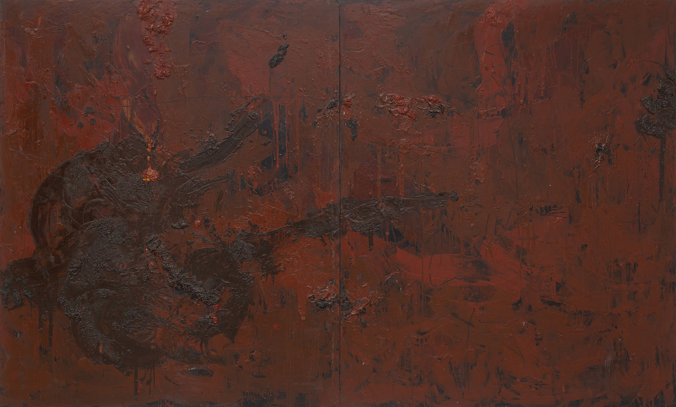
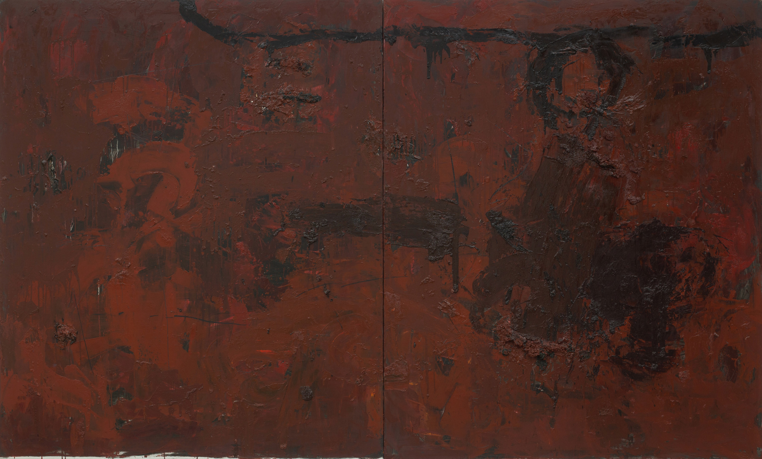
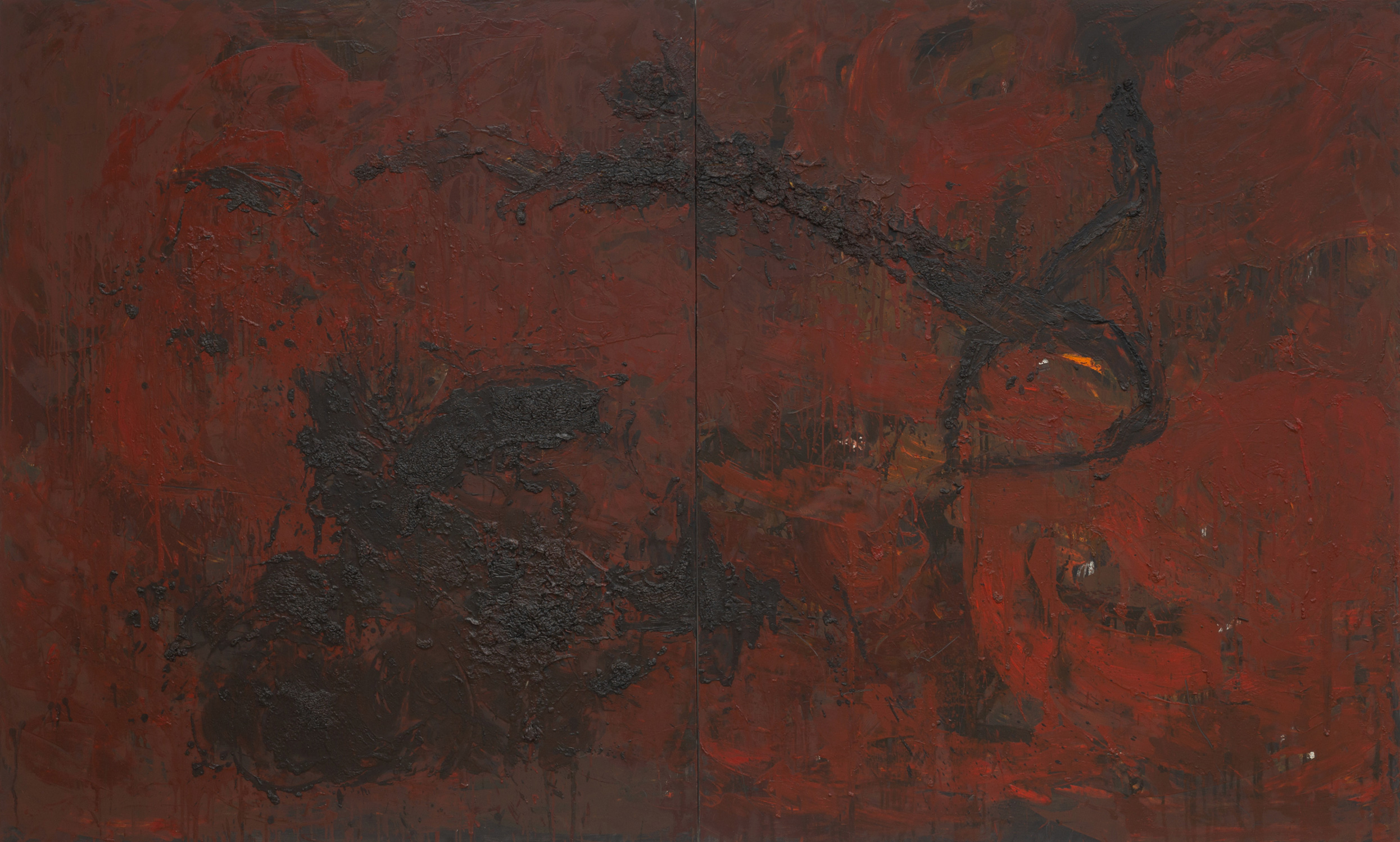
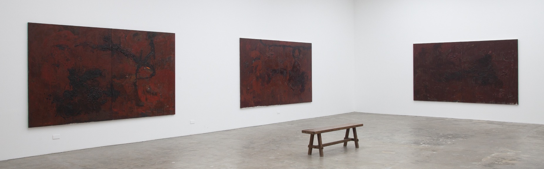
Just as the title of the show refers to uneasiness and being on edge, so do these four huge diptychs called “Red Objects” feel like another stage in his art practice compared to the works that preceded it before the pandemic. It is the first time Pacquing is using red exclusively on canvases, which previously featured fields of layered white, gray, black and other contrasting colors where shapes and materials were discernable, no matter how distorted because of the presence of organic lines found in nature. This series continues with his exploratory approach towards form, structure, and color but deprived of access to unique ephemera and isolation from the outside world, it seems the path to abstraction was influenced by psychological reality more than a visual one. Pacquing grappled with the constantly contingent rules of an epidemic in a foreign land.
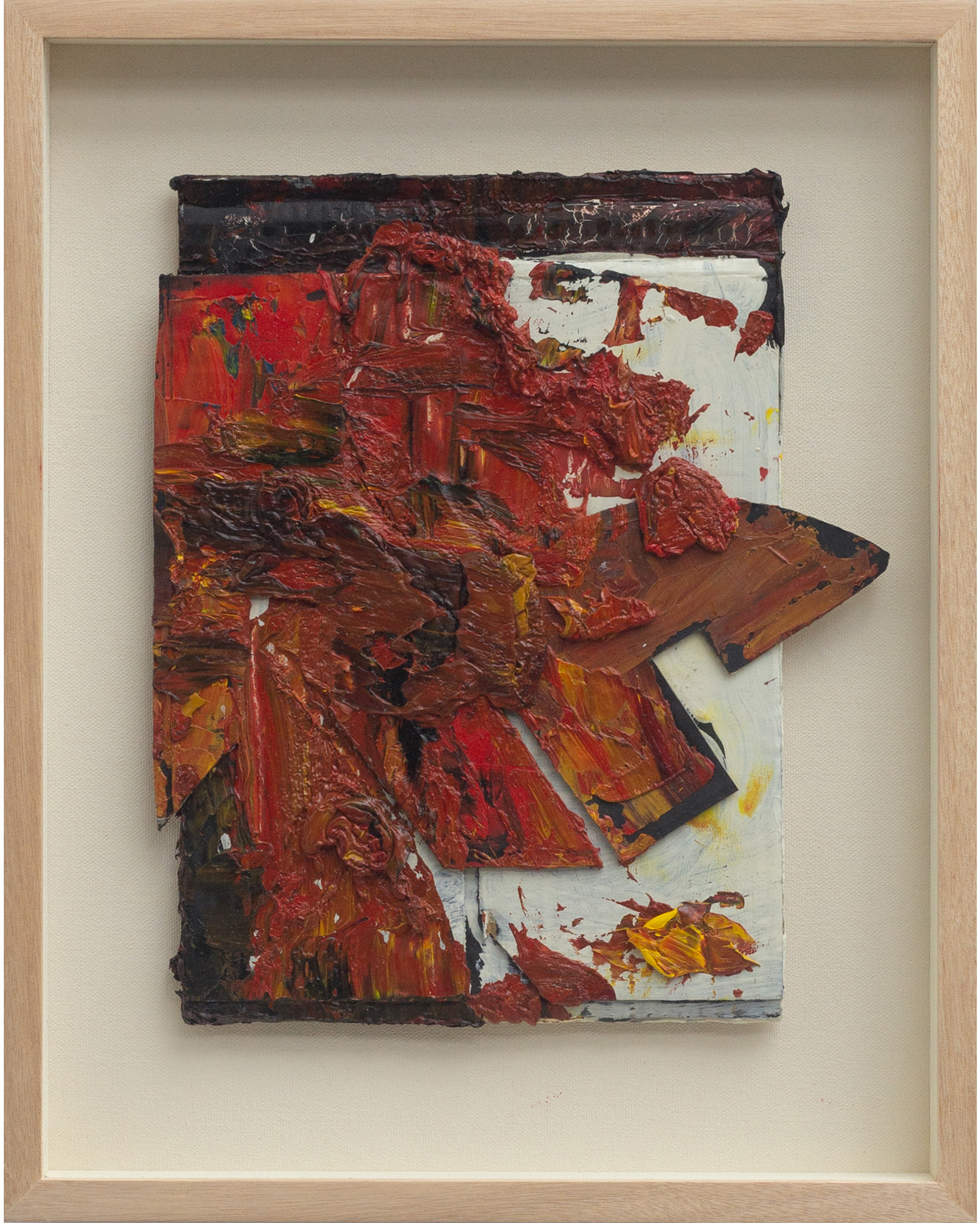
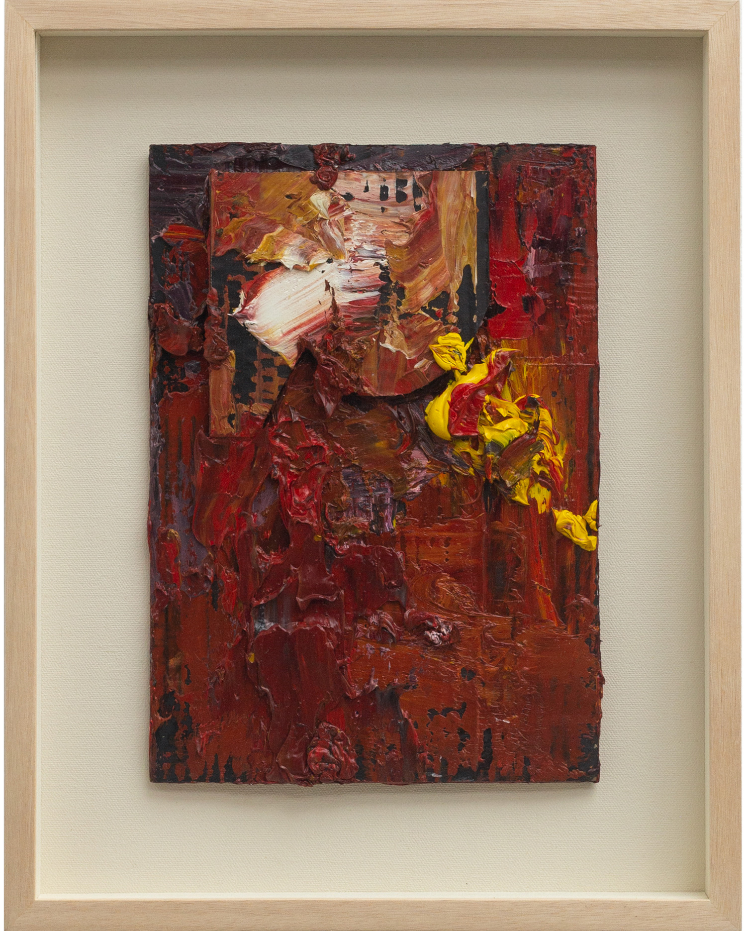
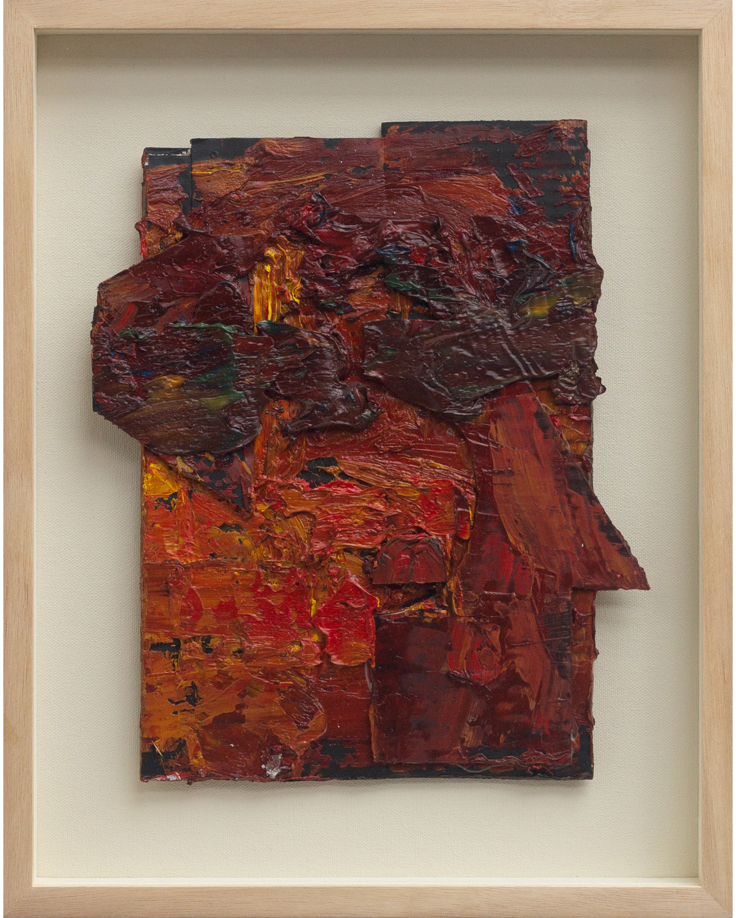
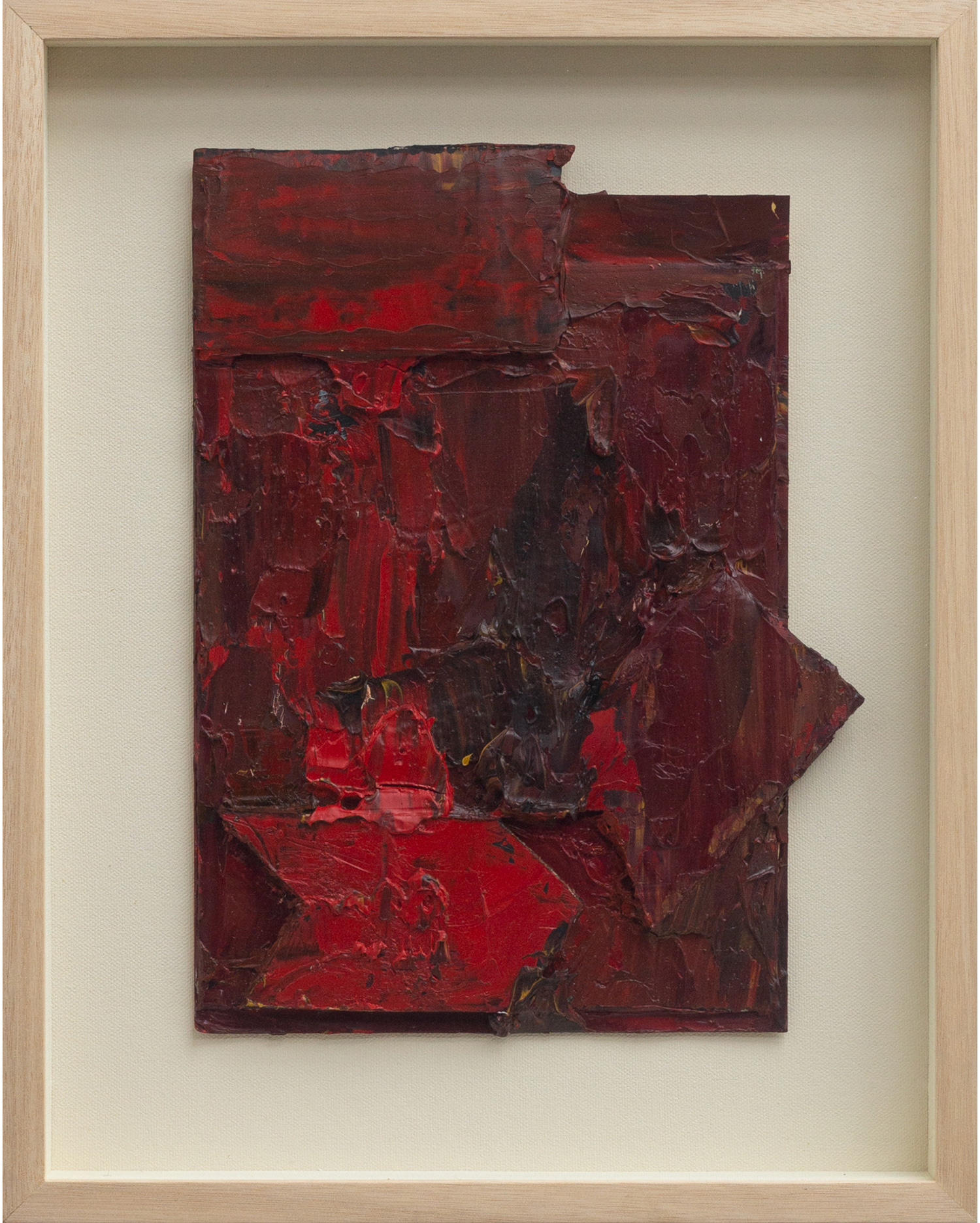
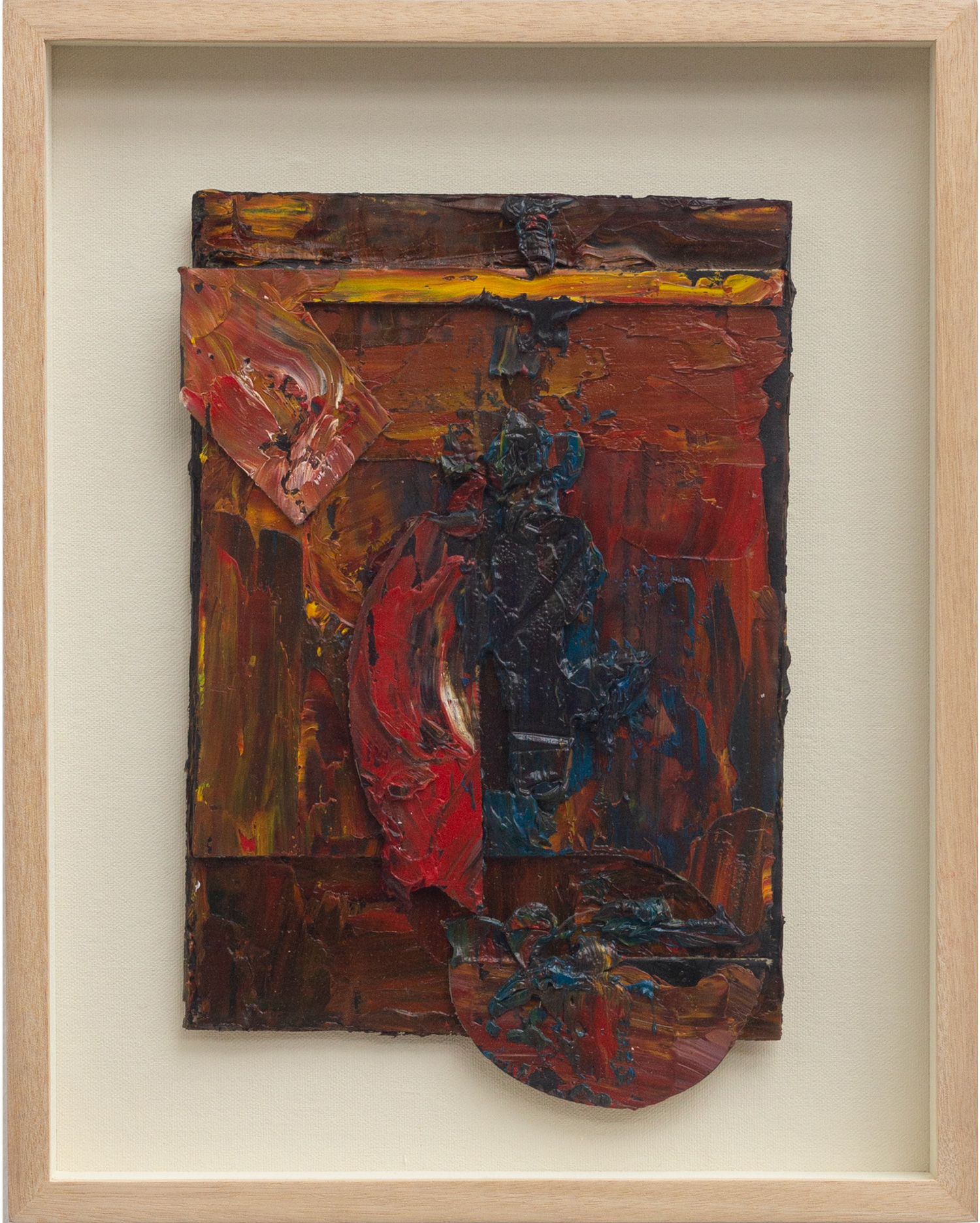
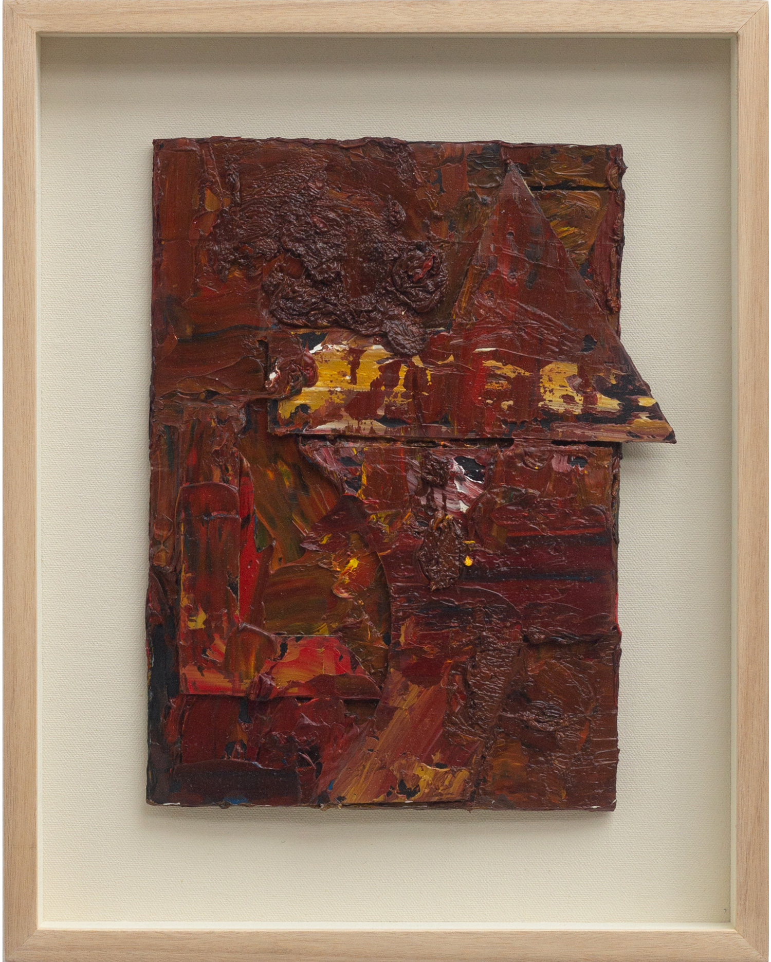
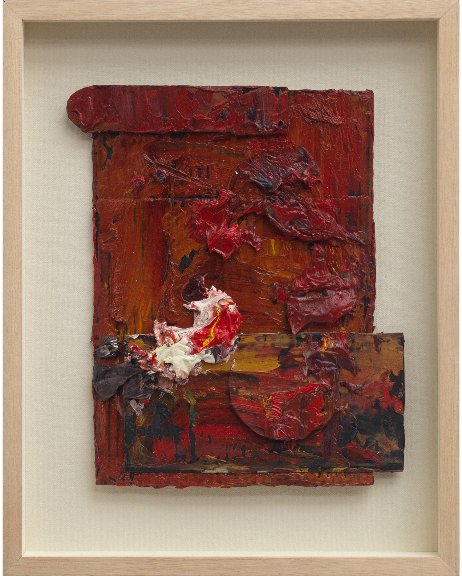
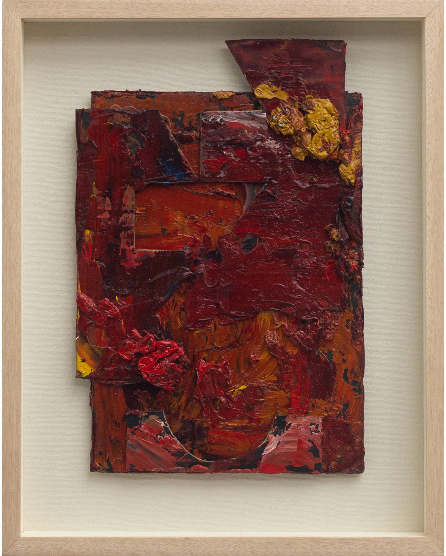
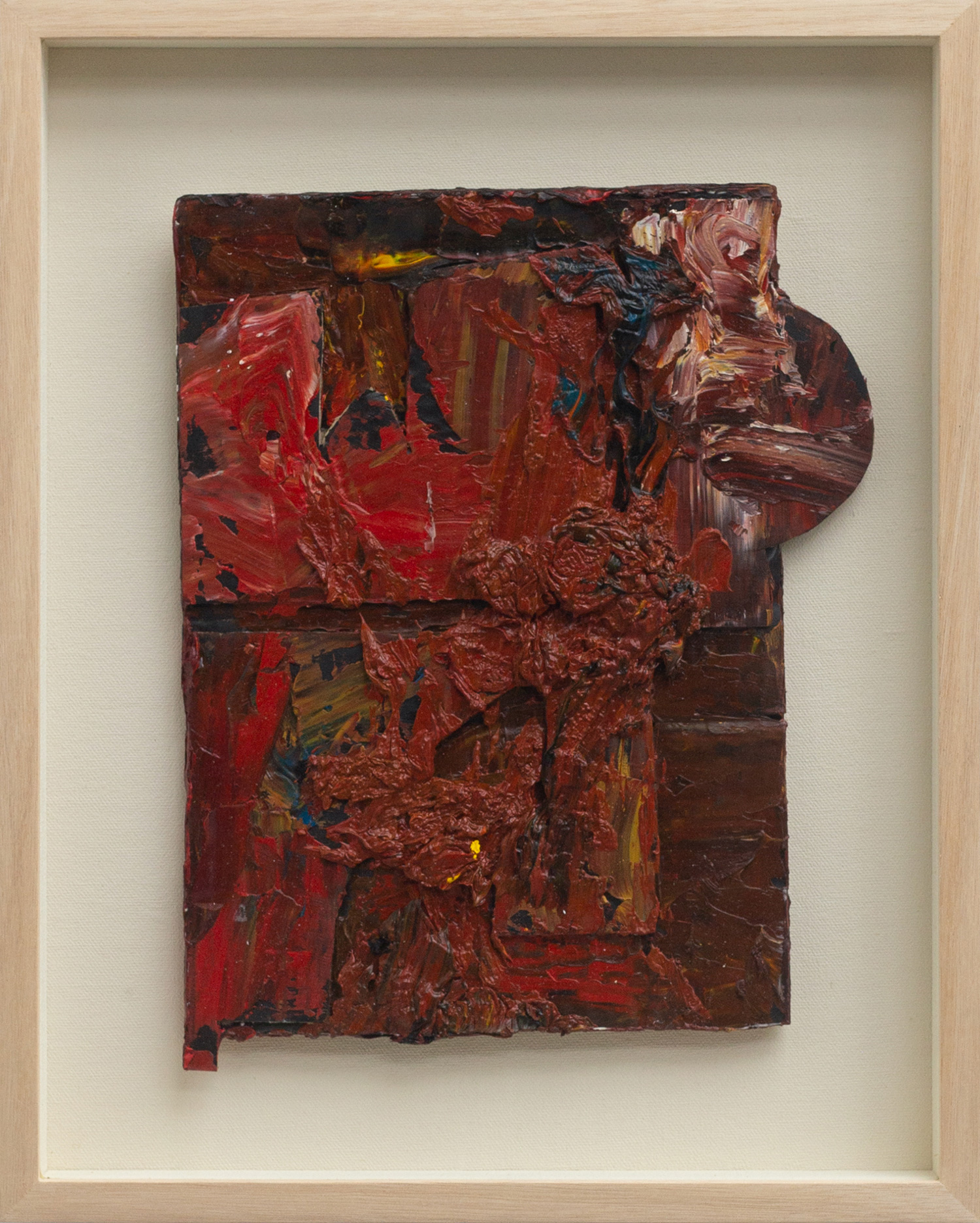
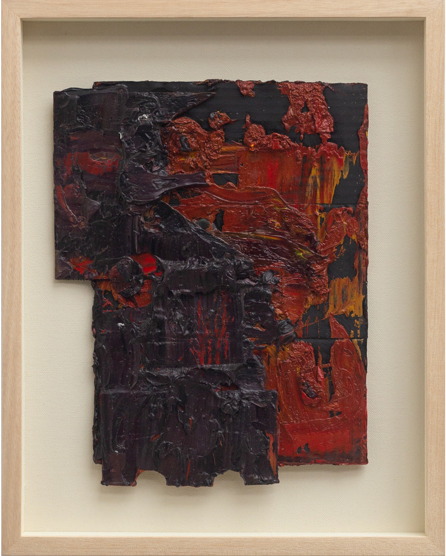
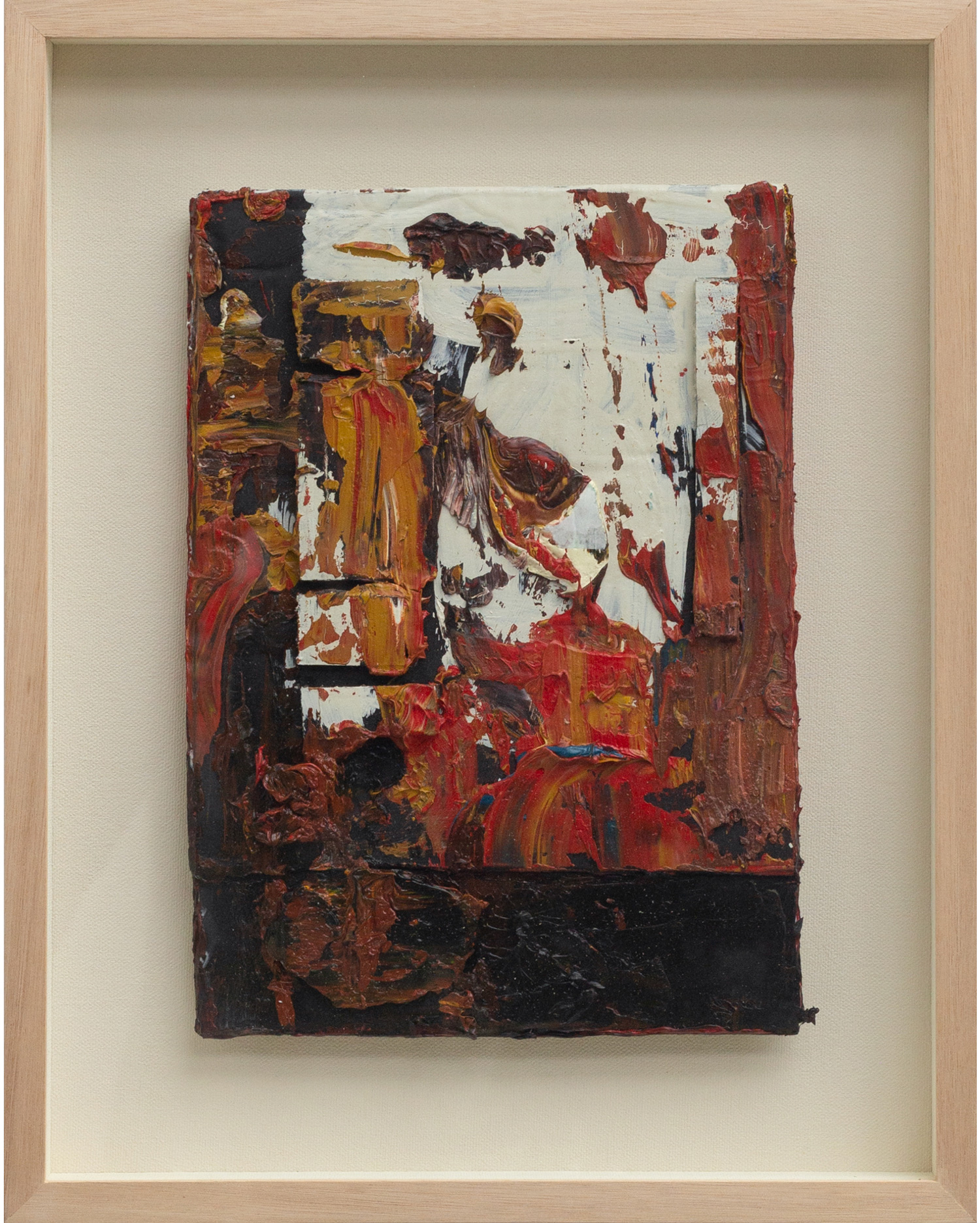
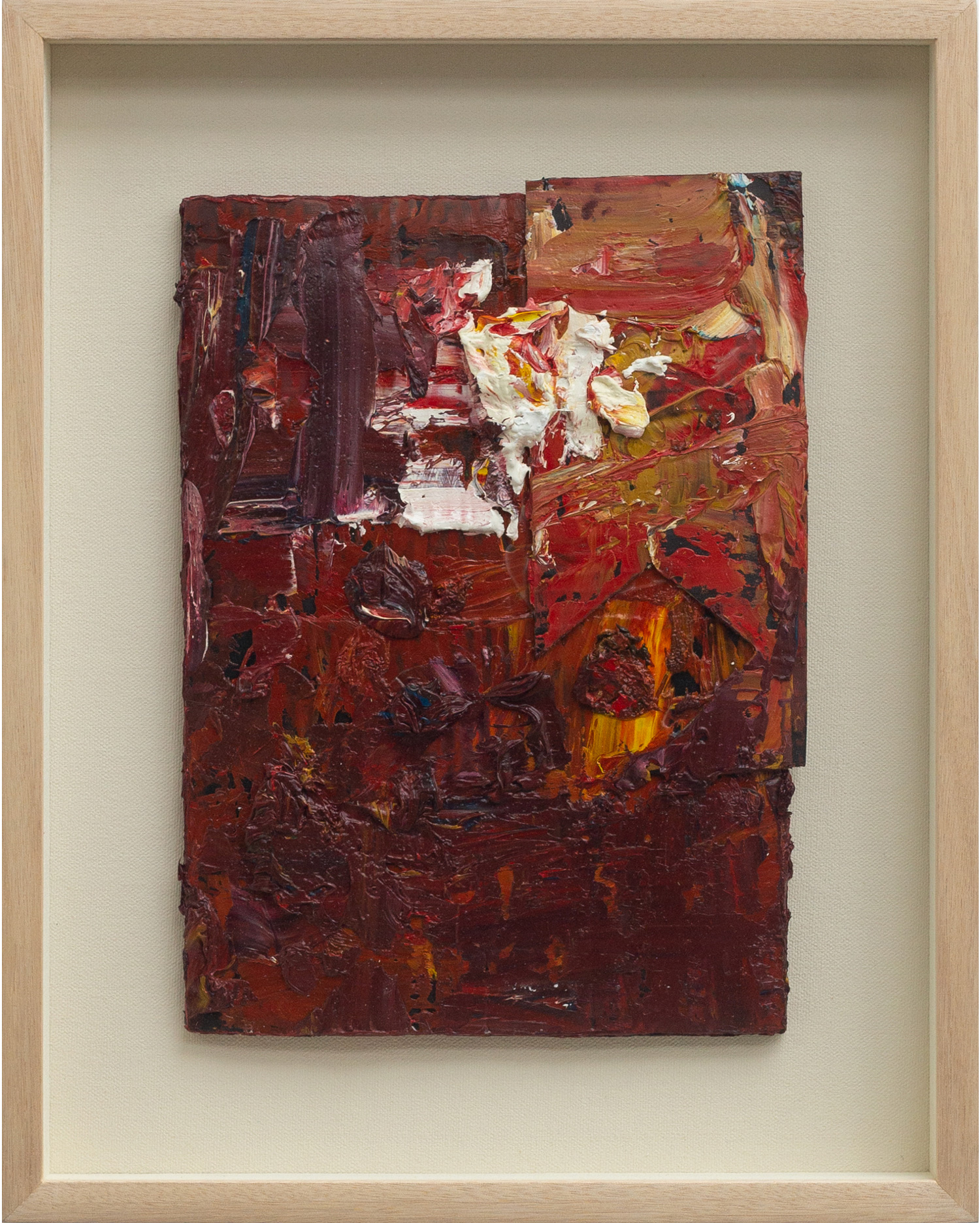
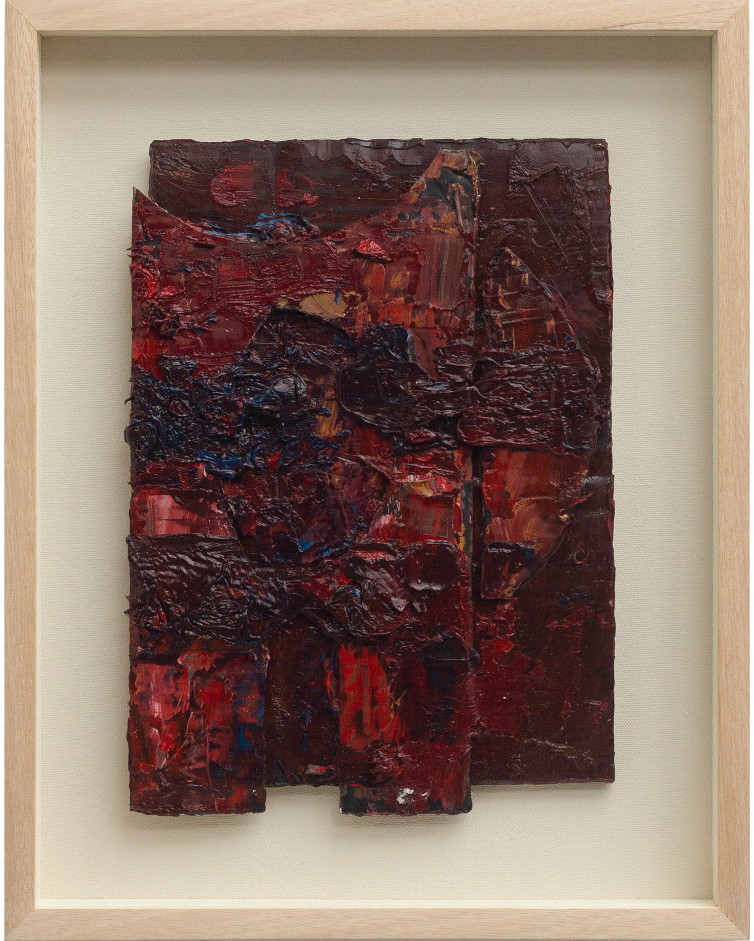
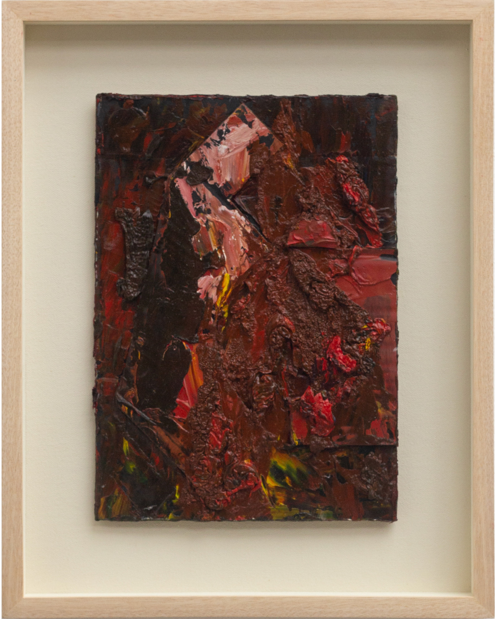
His works are known to use unusual, often ignored materials ranging from discolored industrial paints to woodblocks buried under volcanic ash to rusted nails and even a ruined camping tent which he would incorporate on his canvases to give it a specific matte texture making it part construction, part assemblage of sorts. In comparison, the glossy surface of the new works owes itself to the use of oil paints with linseed oil, which were the most readily available materials in a country with strict COVID-19 restrictions. He began with 15 framed smaller works of oil-on-cardboard compositions called “Beta Chain” building on the thick layers and shades of red as if they were found objects themselves rendering what was mutable and intangible into something with materiality before moving on to the large diptychs. He says: “While gesturing my massive strokes, splattering daubs of thick oil, it dawned upon me I was like scouring on my wide canvas on the floor. It was like being a shaman scouring the bloody innards and guts onto its sacrifice. As if reading some symbols, perhaps looking for signs?”
Maybe there are signs for the viewer, too. The successive coats of underpainting, dripped, splattered and poured paint allows the viewer to reconstruct and follow Pacquing’s loose gestural marks which begin in one canvas and continue to its complementary partner though its mix of dark crimson, cadmium red and black along with its surface sheen makes it harder to look at. The black in some of the canvas works seems to melt into the red, or strokes sit on top of it like calcified crusts. On closer inspection, one perhaps wonders if this is what stepping out of blindness feels like. Red is the first color babies see when they are born. The reds used here are not cold, depressing, or austere, but of throbbing discontent, of caring about what happens next. In one diptych, the color and texture makes it look like exposed flesh, while in another it is the red of ritual and community found on the walls and pillars of palaces and temples. Ceremony and the color red have been used in many cultures to signal the beginning and the end of passages marking a life: birth, weddings, mourning, and even the liturgical calendar.
They say creative work is a product of its time. Pacquing says of making the paintings during lockdown: “It was cathartic. I just hanged on, continued and tried to wade through.” One day, the works that survive made during the COVID-19 pandemic, will offer viewers the opposite of disquietude, which is consolation and relief to see their own experience of disaster reflected and validated from a distance by those who came before them.
Disquietude will be shown at Silverlens from 14 January to 12 February 2022.
- Josephine V. Roque
It’s been a while…
And I’m still here.
It was the February of 2020 when I started my series on red paintings. It wasn’t much back then, but it was very personal for me. Small works of collages painted in hues of red. My first ever to do a series on red. Why red? I don’t know. Maybe it was an instinctive reaction. A catharsis, if I may say.
Singapore, at this point, was carrying out strict rules vis a vis the pandemic. But definitely, it was a feeling of uncertainty ahead. And the lockdowns dawned upon me- Lockdown after lockdown. It was beginning to affect me.
Tones of red were light at first - vermillion, deep orange, even dashes of yellow. I was anxious yet hopeful.
Months went by; my works kept adding up. I even venture into hues of grey. I noticed my colors were getting darker. It was bleak and cold with my grey series. -seems hope was fading. And the rage went on… I tried to compose myself. I continued with my red works. For sanity’s sake, I kept going. Collages turned into canvas work. I see it was a transgression from small works to a bigger canvas work. -5ft x 4ft and then 6ft x 10ft.
Signs of agony and frustrations are vividly visible in my work. Red became darker, deeper into crimson, cadmium-deep red mixed with black. It was a bloody dark red all over my work. It was pure “process art” I was doing. While gesturing my massive strokes, splattering daubs of thick oil, it dawned upon me I was like scouring on my broad canvas on the floor. It was like being a shaman scouring the bloody innards and guts onto its sacrifice and as if reading some symbols, perhaps looking for “signs.” Was I? I don’t know. But it was cathartic. I hang on, continued, and tried to wade through. I finished 4 6ft x 10ft paintings and still doing some more.
For this January show, I will be showing my redwork series. From small collages to a 6ft x 10ft canvas painting. All done in 2020. Show entitled Disquietude.
Bernardo Pacquing (b. 1967, Tarlac, Philippines) continues to approach the expressive potential of abstraction in painting and sculpture through the use of disparate found objects that confront and disrupt perceptions of aesthetic representation, form, and value. By focusing on the organic shapes of visual reality, his work displaces notions of indisputable forms and opens possibilities for coexisting affirmations and denials.
Pacquing was born in Tarlac, Pampanga in 1967. He graduated from the University of the Philippines College of Fine Arts in 1989 and was twice awarded the Grand Prize for the Art Association of the Philippines Open Art Competition (Painting, Non- Representation) in 1992 and 1999. He is also a recipient of the Cultural Center of the Philippines Thirteen Artists Award in 2000, an award given to exemplary artists in the field of contemporary visual art. Pacquing received a Freeman Fellowship Grant for a residency at the Vermont Studio Center in the United States.
Josephine V. Roque is a writer and lecturer based in Manila. She has contributed exhibition reviews to ArtAsiaPacific magazine and ArtReview Asia magazine to name a few. Her first book called "How to Ride a Train to Ulaanbaatar and Other Essays" was published by Penguin Random House SEA.
Works